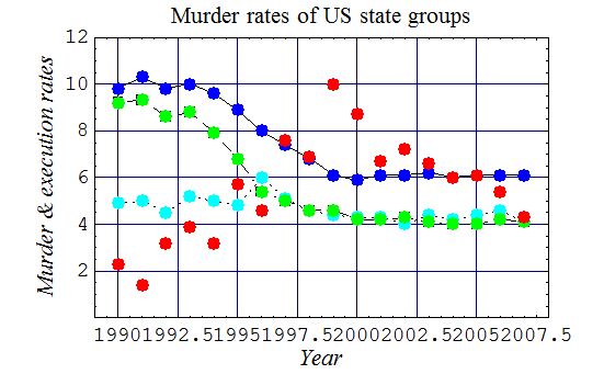
US Murder Rates Relative to the Death Penalty
The graph below, for the period 1990 through 2007 (during which US "executions" peaked in 1998), puts US states into 3 groups:
those which have had executions since 1976;
those with the death penalty, but no executions during that period; and those without the death penalty.
This shows the trends in the murder rates of these three groups, with the US execution rates:
blue = composite murder rates of US states which practiced "capital punishment", since 1976
turquoise = states with the death penalty, but no executions since 1976
green = states without the death penalty
red = annual number of US executions, x 10/98
Data for the graph above
| Year | death penalty states | no-execution states | no death penalty states | number of US executions |
|---|
| 9.8 | 4.9 | 9.2 | 23 |
| 10.3 | 5 | 9.3 | 14 |
| 9.8 | 4.5 | 8.6 | 31 |
| 10 | 5.2 | 8.8 | 38 |
| 9.6 | 5 | 7.9 | 31 |
| 8.9 | 4.8 | 6.8 | 56 |
| 8 | 6 | 5.4 | 45 |
| 7.4 | 5.1 | 5 | 74 |
| 6.8 | 4.6 | 4.6 | 68 |
| 6.1 | 4.4 | 4.6 | 98 |
| 5.9 | 4.3 | 4.2 | 85 |
| 6.1 | 4.3 | 4.2 | 66 |
| 6.1 | 4 | 4.3 | 71 |
| 6.2 | 4.4 | 4.1 | 65 |
| 6 | 4.2 | 4 | 59 |
| 6 | 4.4 | 4 | 60 |
| 6.1 | 4.6 | 4.2 | 53 |
| 6.1 | 4.1 | 4.1 | 42 |
The graph above indicates that, while the murder rates of both the blue (states with executions) and green
(states without the death penalty) declined markedly during this period, the rates of the abolitionist states dropped notably more than those of the "executioner" states.