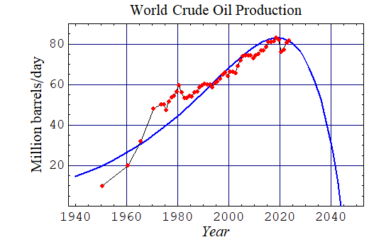
"Seneca curve" of world crude oil production
The points plotted above are estimates of annual world crude oil production, based on data from U.S. Energy Information Administration,
en.wikipedia.org/wiki/File:PU200611_Fig1.png, or www.paulchefurka.ca/Population.html; the blue curve is a graph of y = -9.0163(x - 2044)*e^(.04(x - 2044)).
ourfiniteworld.com, together with current oil-price data from oil-price.net, show some of how, with costs rising inexorably of replacing depleted oil wells with new ones, the prices paid for the oil must rise correspondingly, or oil production will eventually falter.
The peak of the blue-line graph above, at the end of 2018, is based partly on the information at the US EIA link, above.
"don't think about future, don't think what will happen, will be God's will" (davecoop.net/hyla.htm); but, can we guess, or speculate, about these things? Is the collapse of the current paradigm about to slowly accelerate?